Homepage Layouts for Your School Website Design
Marketing Layout
A marketing-focused school website is one of the more common kinds of websites around. These kinds of websites contain a lot of call-to-action (CTA) buttons that invite prospective students and families to talk to admissions and ultimately apply to the school. CTAs come in many forms, often a “more info” kind of button at the end of an article, statistic, blog, or other marketing material. You can distinguish a marketing-focused school website from other sites because of the heavy presence of CTAs.
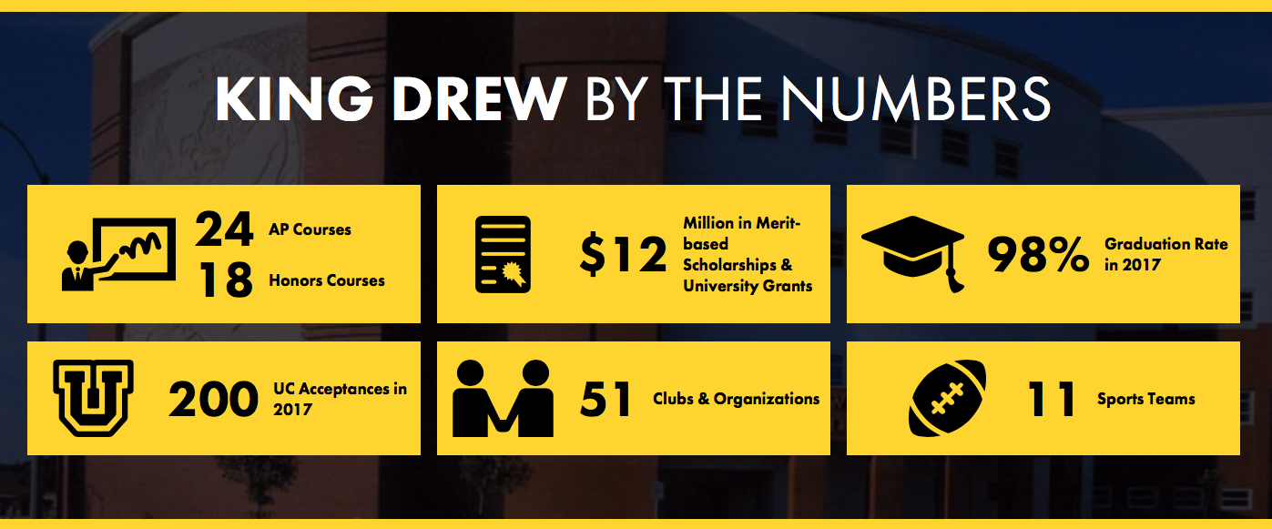
King/Drew Magnet High School of Medicine and Science’s website is a perfect example of a marketing layout, with a “how to enroll” button followed by a description of the school, its accomplishments, and several boxed statistics.
Activities Layout

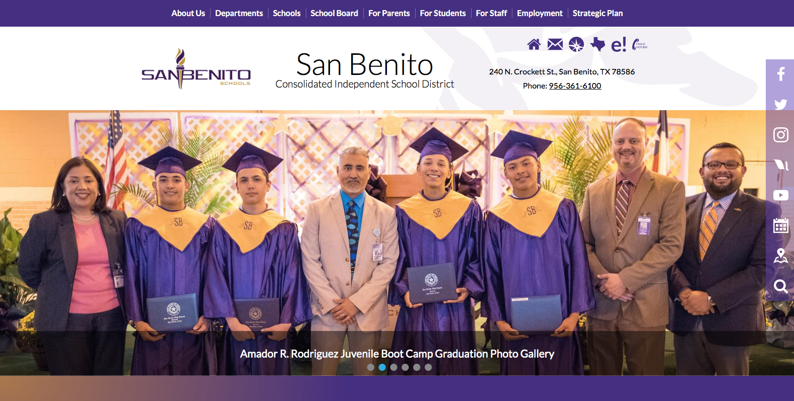
Unlike a marketing layout, the activities layout is light on CTAs and heavy on accessing event and news information. The district’s website design subtly incorporates a sidebar linking to social media outlets among other things. SBCISD’s website also utilizes a spotlight section to promote the activities of its students. This clean and crisp website design contributed to its recognition as one of our school website designs of the week!
I would recommend this kind of layout for a larger school or district that can consistently generate content related to student activities. Committing to this website design requires appealing activities to feature. People are drawn to and engage better with visual information so if at all possible, highlight activities that can be photographed or its video linked to. Sports and other activities that have an “active” visual component to them are just a few examples for this kind of content. Additionally, you should feature a schedule of upcoming events somewhere on the homepage in order to promote participation at upcoming activities.
Including School News in your School Website Design
If the main focus of your school website design is to convey your school’s news prominently, then you should carefully consider the most accessible ways of delivering that news to visitors. School website designs that focus on delivering school news make it extremely simple and easy to find said news.
The most common way to feature your school news is through a rotating set of announcements or stories immediately on the landing page of your school website design. The stories should feature a headline or short caption that links to the fully written article or announcement itself, usually accompanied by a visual to better engage with site visitors. Additionally, you could have your navigation bar include a dedicated news tab that takes a visitor to a news section sorted by date added or importance.
Ultimately your school website design and homepage should be accessible to visitors of all kinds, ranging from prospective students to current students. A navigation bar somewhere on your website is key to making it accessible, and it’s up to you whether or not it should be a fixed bar or floats when someone scrolls down the website. Most schools include a mission or about us tab along with news, academics, and athletics, essentially highlighting what the pillars of the school or district are.
About Jeffrey
I’m a senior majoring in economics with a concentration in global development studies at Grinnell College, a small liberal arts college in Iowa. I’m excited to be spending my 3rd summer in the tech industry interning at Edlio and being able to leverage technology to make a positive impact in the education space. At Grinnell, I’m entering my 2nd year as the photo editor of the newspaper and 8th year doing photojournalism work as well as playing on the soccer team.