What is a Responsive School Website?
Have you ever opened a website on your phone just to have a button become so small that you can’t even access the page you were intending to? Or maybe only half of the website is visible while the other half seems to have miraculously disappeared from your screen. More and more adults are using their mobile devices to access websites while on-the-go. So how do web designers make sure that websites appear correctly on a variety of different devices?
What is a Responsive School Website?
Many parents or guardians have busy schedules and need to check their child’s school website when they’re not sitting in front of a computer. It’s important that websites translate correctly to other devices in order for users to be able to navigate them properly. A responsive school website is one that resizes itself for the optimal viewing experience when accessed on devices other than your standard computer or laptop. Additionally, responsive websites respond to movements that you make. This means that if you turn your phone horizontally, the website adjusts to fill the new width and height as well.
For example, most school websites have a picture display in the middle that rotates through a few different photos. When accessing that website on your cell phone, it can be annoying when those pictures are chopped off or you’re not able to see the arrow on the side of your screen that allows you to rotate through the pictures. Another common problem occurs when buttons or links are too small to click on. A phone does not have unlimited capability to zoom in. It can be frustrating when you can’t submit your child’s field trip registration form because the “submit” button is too small to click on.
These problems occur when a school website is not responsive and they can be a pain for guardians trying to access pertinent information.
The Final Product
All of Edlio’s websites are mobile responsive, making sure that parents and guardians can access their school’s public information no matter what device they’re using. If you access one of our school’s websites from your mobile phone, our responsive sites change multi-column layouts into vertical stacks, allowing readability without sacrificing content or design. Take a look at Kelly High School in Chicago:
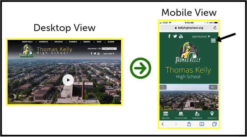
Notice how there are a variety of dropdown menus on the top of the desktop view - About Kelly, Academics, Athletics, and so on. On the mobile view, those page options condense into a small menu that looks like a hamburger, where you can see the black arrow pointing to. This allows responsive websites to hold their integrity without losing their content somewhere outside of the viewing window. You’ll also notice that the video on the desktop view becomes shifted down and resized automatically in the mobile view, allowing visitors to watch the video without it cutting off the sides.
While both versions of the website may look slightly different from one another, all of the content is still accessible in a way that makes the most sense for the different viewing methods.
A good school website is one that users can properly access and view on any device, however, making your school website responsive can sometimes be tricky, even for people with a strong background in technology.
Fortunately, all of Edlio’s websites are fully mobile responsive, meaning parents and guardians in your school community will always be able to see the website’s content, no matter where they are. See it in action today to better understand how your school’s website displays on mobile devices!